This blogpost includes the some images of the editing process for the music video (done by Theo), digipak (done by Satria), and social media (done by me, Nadine).
MUSIC VIDEO
Credit: Theo
1. Colour Grading
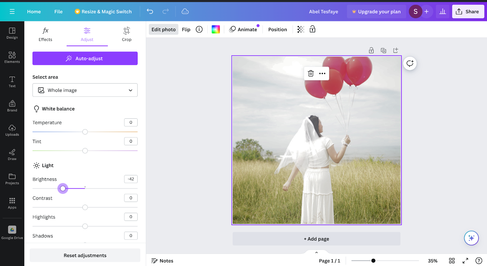
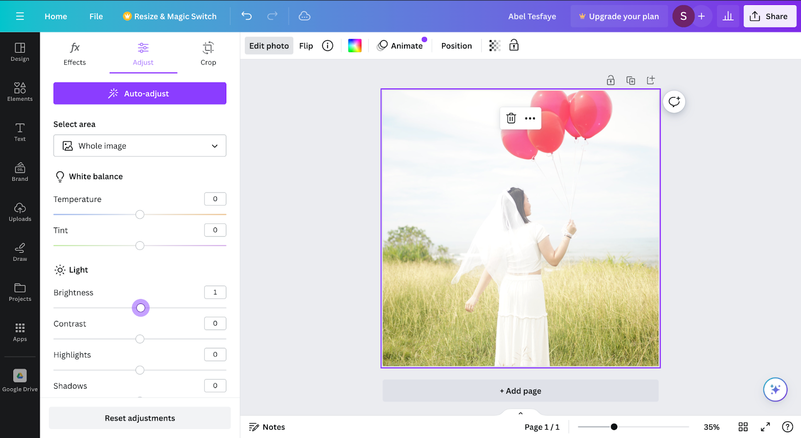
Colour grading is the most essential part of the music video editing where I wanted to make sure where the music video is likely to be visual appealing and spoil the audience. Colour Grading also important in driving the mood and the tone of the music video.


2. Glowing Dreamy Effect
This is done by copying the layer below into the top and putting the Gausian blur effect on top and put luma key in other to get the glowing blooming effect.

3. Music Video Title


4. Stabilizing
Since some scenes were quite shaky I need to edit the scenes to be more stable. I do this by doing some masking on the subject since the effect I used is wrap stabilizer. The masking is important for making sure the subject is not jellying.
5. Slow Motion effect
I do this by slowing down the speed
6. Key frame
I used keyframe technique to make the zoom in effect or zoom our effect


DIGIPAK
Credit: Satria
Credit: Satria
The images above are comparison between 2 same pictures with different filters the first picture above has a darker filter to make the image warmer by adding a slight blue filter on the other hand the second picture uses a bright filter to make everything look shiny. At the end I decided to use the first picture to as the front digipak cover, because with the warmer color it connotes more to the song which in this case have the song have a sad vibe. The warmer color fits more in the digipak due to the warmth it has and a darker brightness. Beside that it also easier to fit a font color on the first option, because it is not to bright while the second option the color is way to bright which may cause difficulties to read the caption.
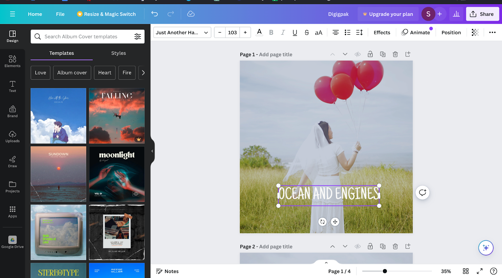
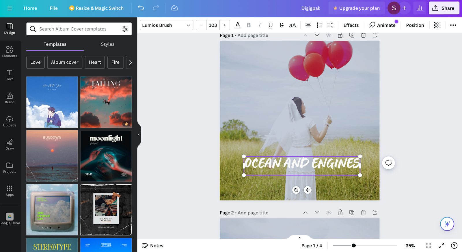
These two image above are comparison of fonts that we might use for our digipak album cover. The first picture has a font that is called "Just Another Hand" this font has a simple and compact design compare to the second picture with "Lumios Brush" font it has a more complex design and to add the first font its easier to read rather than the font in the second picture. We chose "Just Another Hand" for our
In the middle of the timeline I decided to change our font into Louiseville ll, I change to this font instead of the previous font because its is fit better to the background of the digipak and it also has a connotation that this font is handwritten by Luna. We the handwritten design of the font gives the vibe a bit more calming rather than the other are more leanign towards AI generated font, I want to make this digipak look like Luna's is creating it from scratch by herself with her own hand writing.
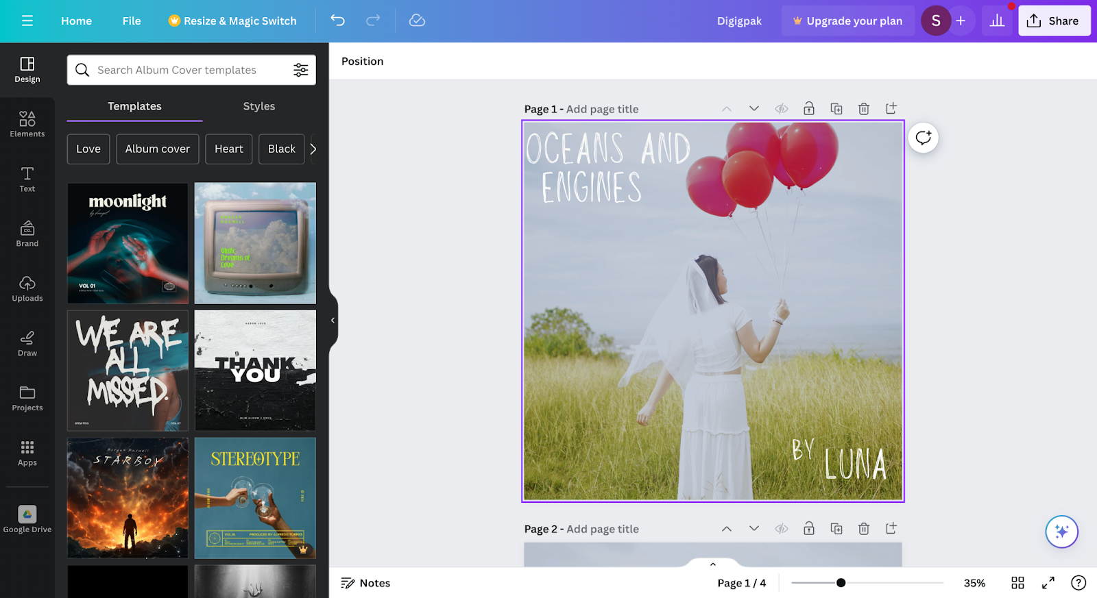
To finalise the design of the digipak i decided to use the Lousieville ll font to use for the final product of the digipak.
SOCIAL MEDIA
Credit: Nadine
Credit: Nadine
First, I used an app called Grid Maker to chop my picture into smaller pieces that fit Instagram posts. Then, I brought those pieces into Canva to make them look better. In Canva, I played around with colors, added text, and fixed things up. By using Grid Maker and Canva together, I made a bunch of nice-looking Instagram posts that all fit together well on the profile, making it look neat and cool for everyone who checks it out.


1. Brown color choice: I picked brown because it gives a cozy, stable feeling, which suits the serious tone I'm aiming for. Brown makes the text feel reliable and down-to-earth, perfect for sharing info or keeping things grounded. It's easier on the eyes than bold black, especially if you're reading a lot. Plus, it blends nicely with different backgrounds, so it stays easy to read while adding a bit of class to the design.
2. Subtle shadow effect: I added a touch of shadow to make the text stand out a bit. It adds depth and makes the text pop from the background, which helps with readability. The shadow gives the text a lifted look, like it's floating a bit above the page, but not too much to distract from the overall design. It's all about finding the right balance so the shadow doesn't get in the way of reading.
3. Italic font style: I used italic to give certain words or phrases some extra oomph. It adds emphasis and style, making those parts stand out more. Italic text breaks up the regular upright text, making it more interesting to read without making it hard to follow. But I made sure not to overdo it, so it still looks neat and easy to read.


I decided to change the format to inject some excitement and captivate my audience's attention. By adding a pop of dark red color to the text, I aimed to make key points stand out and evoke a sense of urgency and intensity. Dark red signifies power and passion, and I wanted my content to pack a punch. For the font, I chose Lumios Brush because it adds a personal touch and injects creativity into the text. Its handwritten appearance exudes warmth and authenticity, making my content feel more relatable and inviting. I wanted my audience to feel like they were having a conversation with me rather than just reading information. Overall, by incorporating these design choices, I aimed to create a visually appealing format that not only grabs attention but also enhances the overall engagement and impact of my message.


Deciding to tidy up my social media layout felt like the right move. It's like decluttering my online space to make it more inviting and user-friendly. I want people who visit my profile to have a smooth experience, like finding things in a well-organized room. By arranging my posts neatly, I can showcase what I'm about and make it easy for others to explore different aspects of my content. Plus, ensuring my layout works well on all devices ensures everyone can enjoy it. Overall, organizing my social media layout reflects my desire to create a welcoming and accessible space for everyone who stops by.
However, I realized that instead of keeping my social media all polished and professional, it's better to make it feel like a personal account. This means sharing more about my everyday life, thoughts, and what goes on behind the scenes. By doing this, I can make my fans feel closer to me, like we're friends. It's not just about showing off my work; it's about letting people into my world and building a real connection with them. This personal touch can help my fans feel more engaged and loyal to me as an artist.


No comments:
Post a Comment